Improved User Slack Messages
Kolide is excited to announce a significantly improved experience for end-user Slack messages.
End-user messages are arguably the most important part of Kolide’s platform. It’s important that the messages are easy to understand and are highly actionable.
One area that needed improving was the experience of sending messages to a user with a lot of similar failures for the same Check. Before this change, Kolide would send a user separate messages for each failure, even if those failures had nearly identical resolution instructions.
This was not ideal for many reasons. First, most people did not realize they were sent multiple messages, and would only read the last one. Even if they did realize, they would have to interact with every message to resolve those failures.
To change this, we wanted to design an experience that respected the user’s time, and made fixing multiple similar failures as easy as possible. Let us walk you through how it works.
Below is an example failure notification. Notice how Kolide has detected 2 unique failures on this device. Now when you click “More Info / Resolve”…

instead of getting two separate messages for each failures, you will now get a single Slack message that looks like the following:
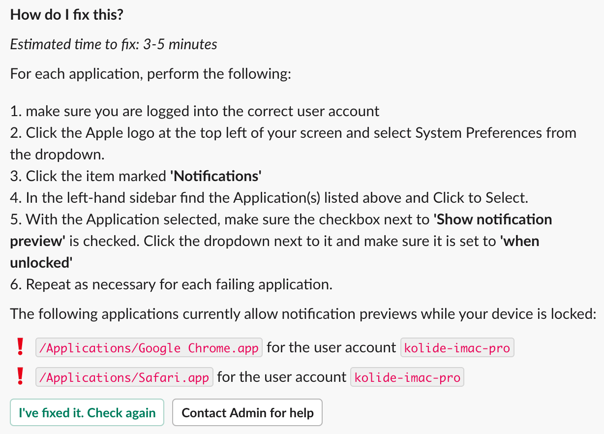
Note that all of the actionable failures are listed at the end of the message with the ❗emoji/symbol.
Now, when a user clicks “I’ve fixed it. Check again” Kolide will recheck each failure listed at the end of the message and strikethrough the ones that the user has fixed.

Kolide has updated all of our message templates to accommodate for this new format. Of course, if you see anything not looking like it should, please let us know.
Bonus: Improved Escalation Message
While we implemented this new Slack message user experience, Kolide took the opportunity to improve how failure escalations to administrators are displayed in Slack.
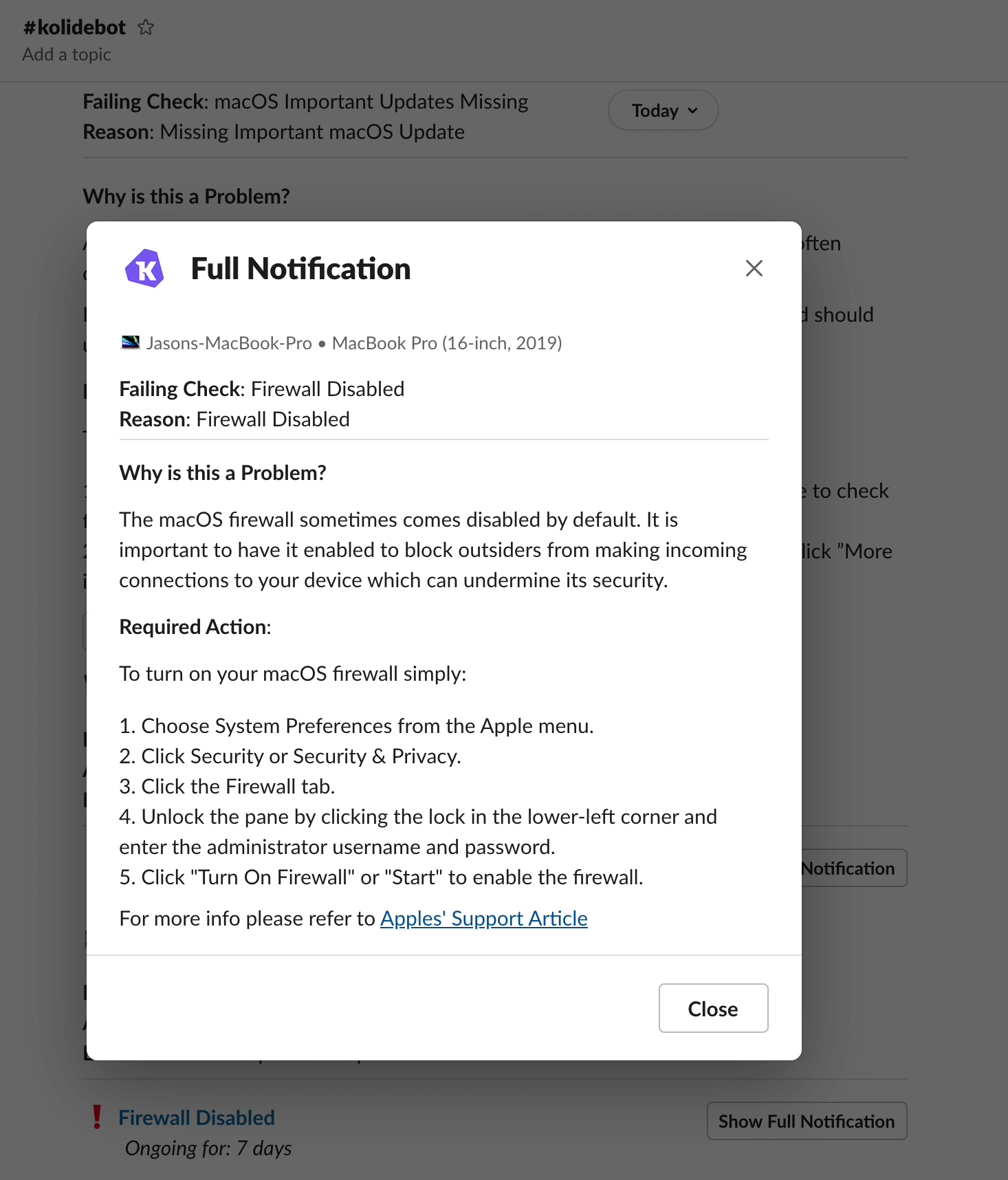
Instead of simply showing the full failure message, we now have a compact notification that includes the most important details.

When you click on “ Show Full Notification”, we take advantage of Slack’s new modal feature to display the full message the user was shown. This allows you to keep the channel nice and tidy for your other teammates.
We hope you enjoy these improvements. We have a lot more planned for the Slack app in the near future!

